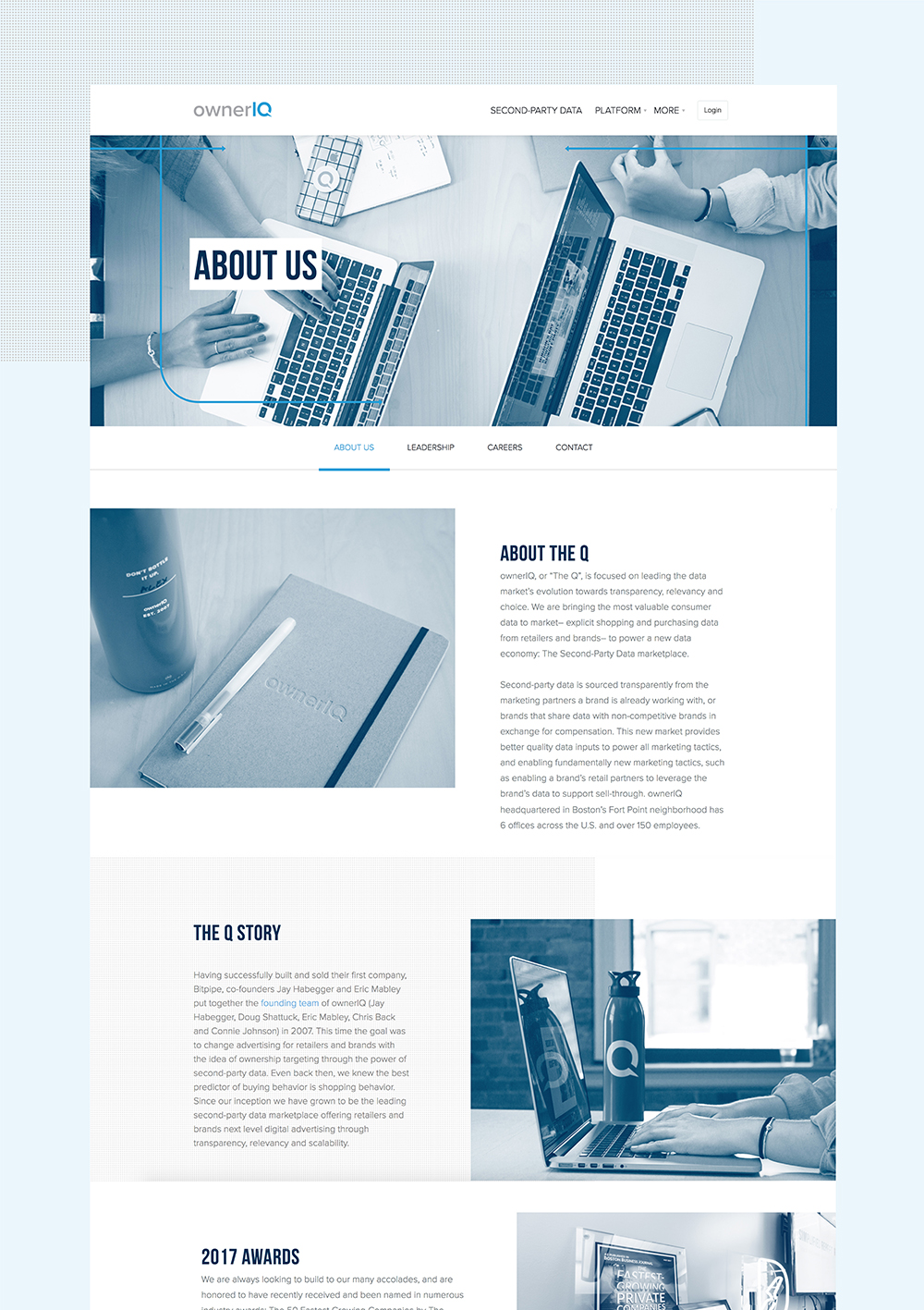
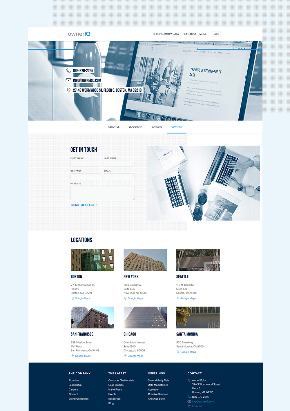
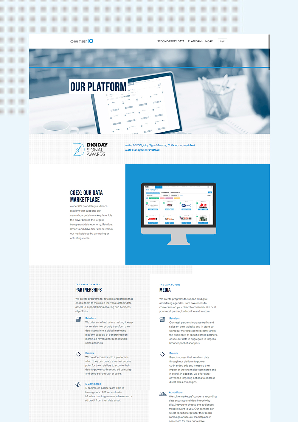
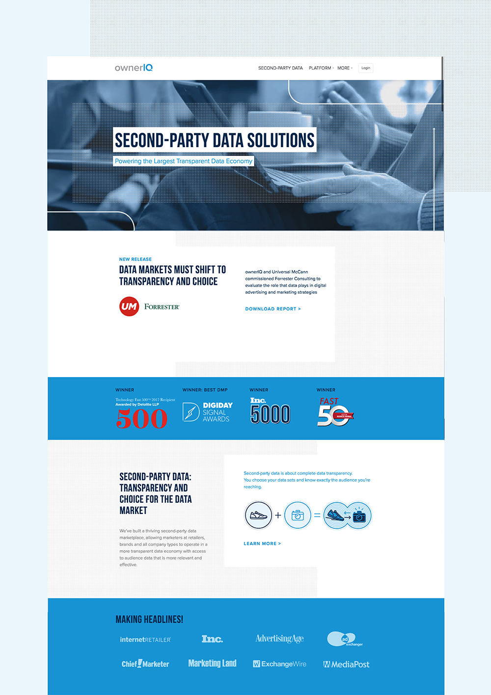
ownerIQ website
While at ownerIQ — a data and media company, I worked on evolving ownerIQ’s brand to better market the mission and style with a website revamp.
Design and front end development
During this website revamp, I made sure to connect our core values to our design. The Q blue is always in the forefront with tints and shades. Navy and white duotone images break up the Q blue. Bebas Neue is the display typeface and Proxima Nova continues to be the default body paragraph typeface. We are a data company; therefore, I introduced a dotted halftone pattern indicating all the data we have. Arrow accents intersecting and connecting mimic brands, retailers, and advertisers partnering. After many hours of testing, the revamped website is responsive and cross-device friendly.


